What is branding?
Branding is the identifying feature that marks a specific company and its product(s). Branding is all around us, every day, even when we don't notice it. For example, many people know the classic golden arches that represent the McDonald's fast food service, or the famous swoosh associated with Nike's athletic apparel. These are examples of name and iconography branding: the name "McDonald's" is instantly associated with burgers and fries, and the M-logo only adds to that association. The same thing with Nike: The swoosh is put onto just about every product they make, identifying what company it's from and attracting attention and recognition from customers. Branding can focus on bringing an entirely new product to the table, or it can be a way to compete with other sellers. If you go to a grocery store, most aisles will have many different packages for very similar products, with the reason being that each one is from a different brand trying to draw in its own customers. Pepsi and Coca-Cola are a good example of branding competition, since they both sell a similar cola product but attract their customers with different branding.
For my brand, I decided on a candy company. Over time, this was refined into a brand that specializes in making constructs and sculpts out of cotton candy, as well as selling cotton candy-themed specialties. My general target audience is towards kids, like most candy stores are. The concept of making figures with cotton candy is how I made my brand unique--there are plenty of cotton candy vendors, but sculpting with the candy is different from the average sweet. Having customizable orders creates a bigger draw for the customers, since most people enjoy the novelty of a normal treat or dish being shaped in a special way that is recognizable. While the specialty products may be more expensive than a normal product, they are generally more appealing to the customers, and other treats that are classic and at standard price would be available.
Unit 1 - Branding
|
Assignment #1: Brand Board
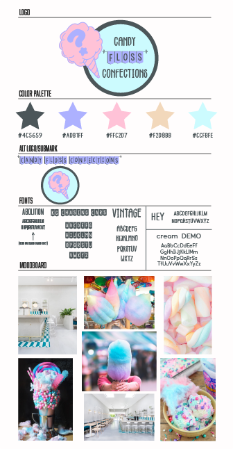
The brand board is the first thing you make when planning out a company design. This is where drafts of logos are made, color palettes are stored, fonts are logged, and moodboards are created to set the tone of the brand. At the top of the image is the logo I created, a simple circular design with text that could easily be adapted to go on any product--even functioning as a standalone sticker, if needed. I used the limit of five colors to keep better unity in my designs: if the colors are the same across all products, a clear connection can be drawn. Below the colors, I tested out some alternative logos, known as "submarks". These are used in places where the full logo is not needed, such as text- or image-only displays. Keeping a log of the fonts is important since using the same styles adds to the brand's unity, like the color palette. The fonts "KG Chasing Cars" and "Vintage" were used in the logo, and the "cream DEMO" font was used for all writing purposes, such as the information on the business cards and in the brochure.
|
|
Assignment #2: Logo & Sticker
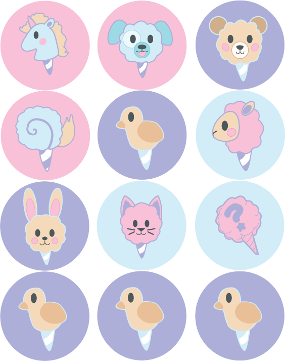
For the logo and sticker design, I wanted to come up with symbols that represented the products I was envisioning. Since the unifying theme was cotton candy, I chose to go for a design of a standard cone of cotton candy for the brand's logo. The question mark on the cotton candy is meant to represent the customizable aspect of the brand, since it's not just a standard cloud cone. The stickers were meant to explore a variety of possible constructs the brand would produce, simple and recognizable animals that are simple in design and shape. I chose to make a variety of them because many real-world brands use a variety of stickers that are seen as collectibles--consumers are often more excited to get a unique sticker each time and may potentially order more to collect them all. That's also why I chose not to put text into the designs: if it was a real company, the stickers would only be found in relation to the store, whether available at a brick-and-mortar location or included in an online order. There's still potentially a benefit to including the company name, but the association is already clear and it allows the customer to have an aesthetically pleasing sticker.
|
|

|
Assignment #3 - Business Card
For the business card, I wanted to keep the whimsical and childlike feel of the company theme in the graphics, shown with the whorls of color, interactive waves, and star patterns on the cards. The information side is more refined and professional, with a cool grey background and a simple name and information layout that is easily customizable to an individual working at the company. I included the name of the company on both the front and the back so that it's clear who the card is from, no matter how it's laid out. I designed multiple looks for the same reason as the stickers, because it is a draw for customers or partners. The multiple designs that are aesthetically pleasing and interesting allow someone to choose their favorite design, which also comes with the company information. This allows the customer to have contact with the company in the future, and the card serves a reminder of the brand and the customer's experience, which would hopefully draw them in to shop at the company again.
|
Unit 2 - Layout & Composition
|
Assignment #4 - Pamphlet Design
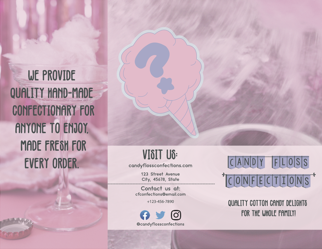
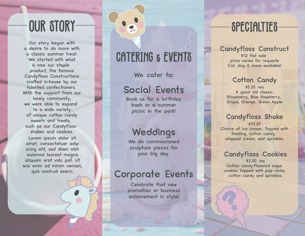
A pamphlet is made so that a lot of information can be handed out quickly. They are often at events, hotels, and new businesses for customers to pick up and read. I designed my pamphlet to give an overview of the purpose and "history" of my brand, starting with the "Our Story" panel on the inside left to describe what the company offers and how it was started, so that the customer gets a feeling of understanding and closeness with the company. The middle panel introduces some larger-scale events the company does, to draw in interest for those not looking for a simple candy-shop trip. Many food-related companies, especially those with gimmicks or trademark items, offer events that further promote the brand. Finally, I included a brief "Specialties" menu that gives the customer an idea of the unique products that are sold. This is meant to pique the customer's interest and potentially bring them into a brick-and-mortar store. On the back of the brochure, I included a "Visit Us" page, which is standard procedure in most marketing these days. This provides contact information for the store through an address, a website, an email, and a phone number, as well as ways to keep up with new things through the social media information.
|
|
|
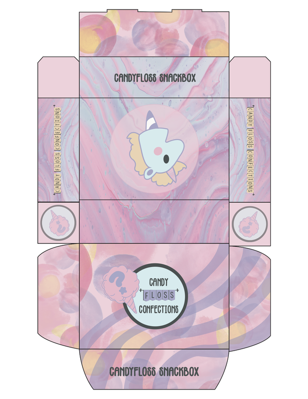
Assignment #5 - Packaging Design
The packaging design gave me a decent amount of trouble in the sense that I wasn't sure what I wanted to put on the box. There was a fine margin between "too simple" and "too busy" in the design, and I tried my best to balance it evenly. The main thing I wanted was the company name and logo displayed prominently from any angle, so that the brand it displays is clear to all. The lines that go across the lid are a callback to the business card's appearance, and I used elements on the bottom and sides that were rejected assets from my brochure design. A box like this would likely be made at a few different scaled sizes and used for online orders or carry-out orders that are sent to customers.
|
Unit 3 - Gif Animation
|
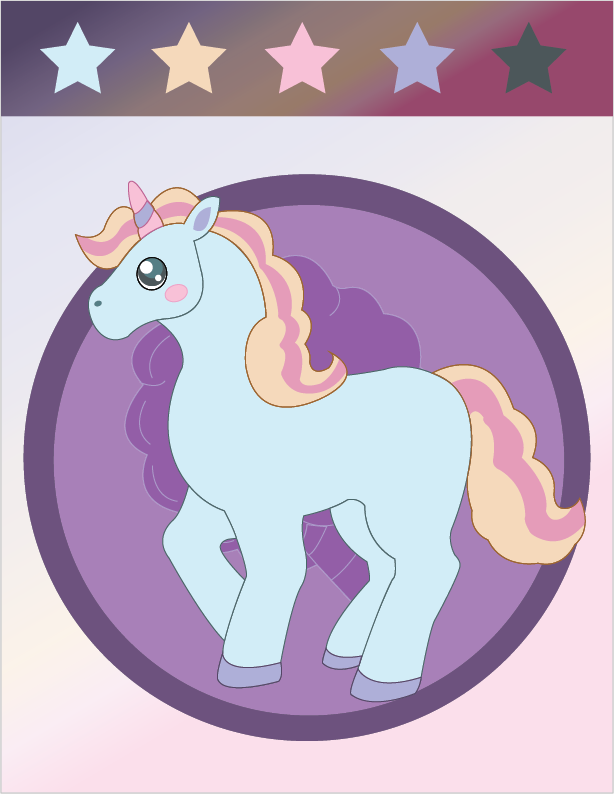
Assignment #6 - Mascot Design
I chose to use the unicorn design I first thought of for the stickers as the brand's mascot. The mane and horn both have a candy-stripe pattern that is intended to add visual interest and relate to the theme of cotton candy and sweets. I tried to make the mane look big and fluffy like cotton candy, to fit with the theme of the mascot more. The selection of a unicorn fits the idea of a fun and lighthearted brand targeted towards children, and it relates to the idea of mystery and fantasy that the brand inspires through the main product of cotton candy constructs. I drew the mascot in a cartoony style that can easily be replicated by any artists and designers employed by the company, able to be produced quickly for promotional material, new products, and events. A design like this could also easily be used as a reference piece if a mascot suit was made to be worn at events. The simplified design makes it easy to understand for anyone of all ages, and makes it look more approachable to a younger audience that is likely well acquainted with cartoons and fables.
|
|
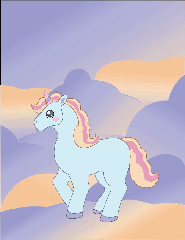
Assignment #7 - GIF Animation
For the .GIF design, I decided to animate the mascot, since it's something that would make sense moving and represents the brand. To do this assignment, we had to learn some features in Adobe Photoshop for the first time, having only used Adobe Illustrator before this point. To create this animation, I first studied a video of a horse rearing and created a series of sketches of different stages of the video. From there, I had to use Illustrator to create five individual frames of the animation: starting with the unicorn standing normally and progressing upward, frame-by-frame, until the jump had been completed. To have the unicorn come back down, I simply reversed the frames in order. This uses the least amount of individual poses while still conveying the full motion. Finally, I had to save the file as a .GIF file and make sure the timing was okay: too slow and it became jerky, too fast and you can't get a good look at it. In the end, I think it was a good end to our branding unit. I'm proud of this animation, especially since it's the first and only finished animation I've ever made.
|
|
